WELCOME TO HOMESMITH'S BRAND GUIDELINES
Designed for ease of use.
This section contains all the information you need to get started with working on your very own Homesmiths brand designs. The guidelines apply to both online and offline communications. If at any time you are unsure about any of the rules, principles or guidance, or simply need more information, please contact us: trademark@homesmithsdiy.com
Let's get started
BRAND COLOURS
Main brand colours
Honey is our main brand colour. It should always lead visual design, so that over time, it will become the colour customers always associate with Homesmiths. Black is our secondary colour — it should never be used more than Honey. Black is also the colour for text, whether it's headings or bodycopy. NOTE: The colours below are based on Pantone® Colour Bridge® Coated Euro specifications. Follow the (Hex, RGB, Pantone, CMYK) colour guidance as shown inside the individual colour boxes below.
#F0AB00
Pantone 130C
C.0 M.35 Y.100 K.0
R.240
G.171
B.0
Honey
Honey is our primary brand colour and main identifier. This is the impression every customer should remember when they think of the brand.
#1E1E1E
Pantone Process Black
C.0 M.0 Y.0 K.100
R.30
G.30
B.30
Black
Black is our secondary brand colour and should be used confidently. However, never let it dominate Honey. Text should be in black when on a ‘lighter’ colour background.
#82786F
Pantone Warm Grey 9C
C.23 M.32 Y.34 K.53
R.139
G.120
B.120
 
Slate
Slate is used when you need a middle ground and when black is too strong. It may also be used in text, however, this should be used sparingly.
#white
White
White is the brand’s base colour. It helps to create an impression of precision, control and cleanliness. Text, when paced on a Honey or Black background, may also be shown in white.
Example of the primary colours in a design:
Example of the primary colours in packaging design — a simple set of design elements can generate a strong brand impression:
Secondary colours
Honey is our main brand colour. The secondary range of colours have been chosen to help you add variety in the design system — this may be required when colour coding for instance, or when you need to differentiate different sections of a layout or design. You may choose more colours for colour coding from the Pantone book (as shown below), however, please seek advice, and final permission from the brand team when adding more colours to your design. NOTE: The colours below are based on Pantone® Colour Bridge® Coated Euro specifications. Follow the (Hex, RGB, Pantone, CMYK) colour guidance as shown inside the individual colour boxes below.
#AAA38E
Pantone 7536C
C.11 M.13 Y.30 K.32
R.170
G.163
B.142
Cedar
Cedar may be used as an accent colour when colour coding. It works well for areas where warmer and softer effects are required.
#35C4B5
Pantone 7465C
C.57 M.0 Y.32 K.0
R.53
G.196
B.181
Mint
Mint may be used as an accent colour when colour coding. It works well for areas where stronger colour standout is required. Use sparingly.
#9F7F9A
Pantone 5145C
C.25 M.50 Y.5 K.20
R.159
G.127
B.154
Rogue
Rogue may be used as an accent colour when colour coding. It works well for areas where stronger colour standout is required. Use sparingly.
#7D9AAA
Pantone 5425C
C.45 M.16 Y.9 K.26
R.125
G.154
B.170
Fossil
Fossil may be used as an accent colour when colour coding. It works well for areas where more technical and precise descriptions or designs are required.
Example of the secondary colours (mint & fossil) in a design:
Download official colour palette (.ai Creative Cloud 2015)
The logo
Our logo has been expertly crafted and represents us in a simple and iconic way. It has been designed to help us stand out from the crowd and therefore, must be used correctly and in it's purest form. Never alter any aspect of the logo — and always use the original artwork as supplied in the download link below.
When placing the logo on white or light backgrounds:
Primary vertical full colour — this is the main usage version of the logo
Vertical single colour 
Vertical black
Horizontal vertical full colour 
Horizontal single colour 
Horizontal black
When placing the logo on honey or darker backgrounds:
Primary vertical full colour — this is the main usage reversed version of the logo
Vertical reversed
Vertical black 
Primary vertical full colour 
Vertical reversed
Vertical honey
Primary horizontal full colour
Horizontal reversed
Horizontal black
Primary horizontal full colour
Horizontal reversed
Horizontal Honey
Positioning the logo (principles):
  • Central placement on any surface is allowed (e.g pure branded designs without any other messages – remember to use the vertical version)
  • As a general rule, the logo should be centered on surfaces towards the top of the design
  • For print advertising, centre bottom placement is recommended
  • For all screen designs, place the logo top left (use the horizontal version as headers don't allow for that much space)
  • For horizontal surfaces where vertical space is restricted, use the horizontal version of the logo – ideally centre positioned
  • For smaller formats with limited space such as business cards or stickers, use the vertical version
Scaling the logo (principles)
  • Three's the magic number. For most designs, this princple will apply in scaling the logo — as well as determining a consistent placement
  • When left ranging the logo, use the scaling of (1), and determine the positioning from the left edge using the symbol as a measurement unit
  • For on-screen use, there is no one way to specify sizing due to screen size variations — this principle demonstrates the logo inside a nav bar
Where to place the strapline ’Heart your home’ in relation to the logo:
  • Heart your home is our strapline. It does not always have to appear with the logo, however, it should never appear without the logo present on at least the same design surface, or for web, somewhere on the page such as at the bottom
  • Official artwork is available for all the logo variants, with and without the strapline
Download official logo artwork
Logo safe zone
Always leave some space around the logo. The light grey area shown is measured using the letter H. Make sure nothing appears within this ‘safe zone’ as it may damage our recognisable logo.
Usage rules
Never alter original logo artwork. The Homesmiths mark represent the core values of our brand. Please don’t present the logo (or any of its variations) in a manner that damages the original artwork designs, or confuse Homesmiths with another brand. Always use our official and unmodified Homesmiths logos to represent Homesmiths.
  • Don't alter anything in the original artwork.
  • Don't add effects such as drop-shadows, outlines or other colours.
  • Don’t change the position of elements in the logo.
  • Don't change or use any other typefaces.
  • Don't squeeze or stretch the logo, and never tilt or angle it in any way.
  • The examples below are just a few illustrations – — If you’re unsure about anything, please contact the brand team.
Download official logo artwork
TYPOGRAPHY
Typography
Pluto is the official Homesmiths font — typography is and integral and recognisable part of the Homesmiths brand. 
Example of a playful typographic integration of text and image:
Example of Pluto in design use (online):
  • Pluto Light: Best used at larger sizes (Above 20pt / 16px)
  • Pluto Medium: May be used at all sizes, including bodycopy (Minimum 6pt / 8px)
  • Pluto Bold: Used to highlight important text, or to make smaller text visible (Minimum 6pt / 8px)
Download official font
Software licencing restrictions for fonts are the same as any other software package. We can’t share the actual font for download from this page. You must purchase a commercial or individual licence for this font from the font vendor and download it from there. Please see Vendor page for more details.
HONEYCOMB GRAPHIC
The honeycomb graphic
The honeycomb graphic is a textural vector based design element and is part of the Homesmiths brand identity. It does not have to be used everywhere, however, when you’re designing a piece where you need to add an element of recognition to a plain surface of Honey colour, you may choose to use the honeycomb graphic as shown below. Other examples of the graphic in use can be seen on our stationery, as well as social media ‘header’ images.
Inspired by the, well... honeycomb :)
The honeycomb graphic in ‘raw’ form as supplied in the official artwork. Ensure you crop, colour and use correctly.
Here's an example of how the above honeycomb graphic is cropped, and then placed into the final design as shown at the bottom of this sequence:
This guidelines site also uses the honeycomb element as shown here:
And the final example — the honeycomb graphic used in a packaging backdrop template:
Download official honeycomb graphic
IMAGE STYLE
Images and photography
The Homesmiths image theme is ‘authentic’ – this means the images are never overly polished or staged and create a feeling of the ’real-world, real people’ — the images must inspire our customers to come in and visit the store, and create their very own DIY projects. The section below shows some some examples of a selection of officially purchased Homesmiths images (Shutterstock®). Please ensure you have the usage rights and correct licensing for any images you use in Homesmiths designs (print and online) and attribute © to the image owner where required.
Inspirational images and examples of the brand and design system in context:
Download official brand images
LAYOUT STYLE
Layout style
The Homesmiths layout style is simple and clean – it's based on simple, modular rectangles containing information such as colour, images, text, textures and so on. The theme is similar to how a modern responsive website uses sections, containers, columns and div blocks to structure information. The section below shows some simple ‘schematics’  that will help you understand the layout principles of the brand. There are no specific grids, rules or measurements for layout as it is not efficient to specify measurements for digital or analogue communications. For digital, design should always be responsive and work across all viewports such as Desktop, Tablet and Mobile devices – you should base development work on a standard 1170px grid as shown below — this grid is also available as a downloadable asset. 
  • A4 page or any visual design space: Start with a 1170px layout grid (notional example above - full example below) as supplied and add full width simple rectangles
  • Place and snap rectangles to edges of page and each other. You can adjust the rectangle heights later on (print or digital)
  • Once you start adding the design elements you will need to adjust the rectangles to fit the content (colour, images, text etc.)
  • The same principles apply for any visual design space (print or digital)
  • Never arbitrarily angle the rectangles as this creates a look and feel that isn’t Homesmiths ‘design language’
  • Never hover graphical rectangles on their own and never add circles to the design system (see above point)
  • For rectangles with a chamfered edge, you may use a 45 degree angle. Start with a single block...
  • Measure the angle
  • And execute the angle. This is acceptable in the design system as the effect is quite subtle
  • Never use angles that are arbitrary
  • Never introduce circles
  • Never round off corners of design elements
  • See point 7
  • See pont 8
  • See point 9
Example of the 1170px layout grid for web:
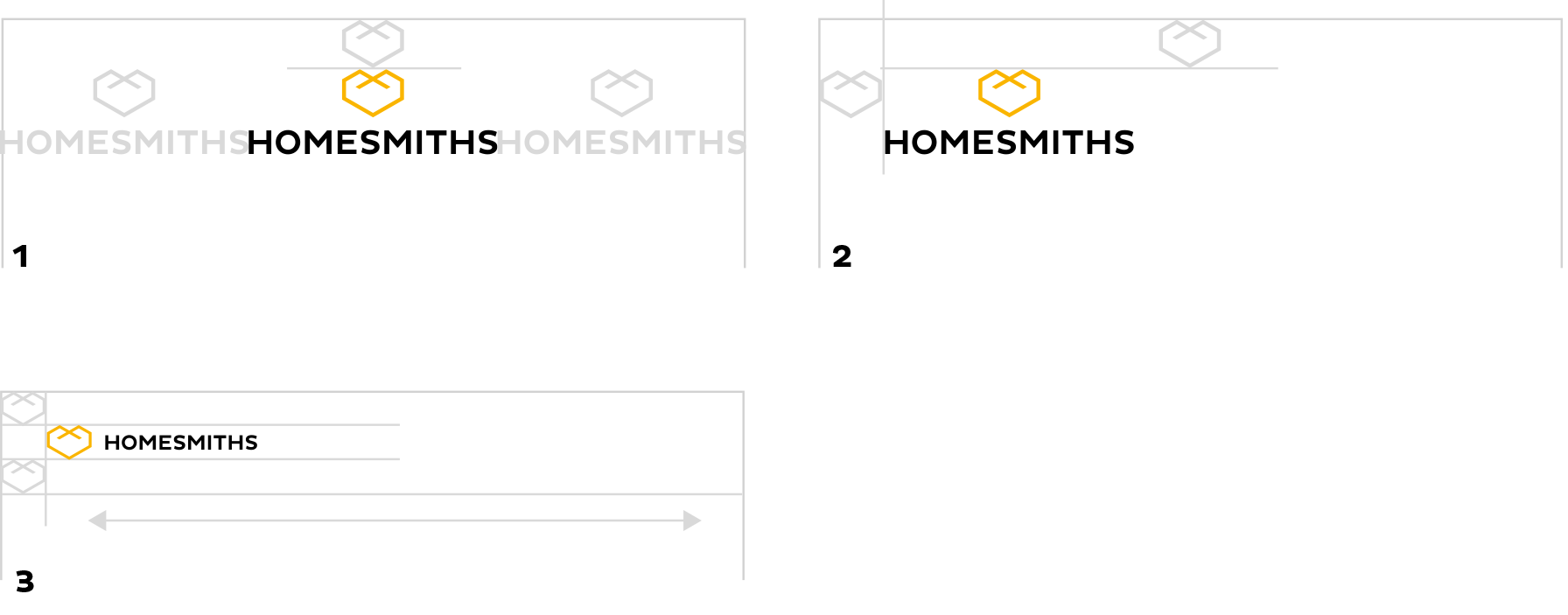
Download layout templates (.ai Creative Cloud 2015)
SOCIAL MEDIA
Social media basics
Social media is busy and noisy. Ensure all design and brand assets on social media are used in a simple and clean way. There’s no need to over design or engineer any of the design elements as the messages and engagement with the community is most important. The Homesmiths brand and designs should never shout for attention — simple and elegant is always better.
Homesmiths avatars for social media platforms, and app icons, should always look like this:
Social link icons on the Homesmiths website, and on other communications, should be inside the hexagon holding shape:
Social icons and social names/domains on print material does require the hexagon shape:
Backgrounds for social sites should be simple and iconic – two examples are shown below:
Download social media assets
Tone of voice and messaging
Homesmiths TOV is smart, informal and clear – remember: ‘Behind every good tone is a good brand’. As tone of voice is dependent on great writing that is in line with the positioning, mission and values of the brand we encourage the use of professional copywriters. Below are some great examples of Tone of Voice writing from professional writers
Read great TOV examples